CNH industrial
New Interface to Help Farmers Optimize Field Operations
Brand Strategy
UX / UI
Visual Design
“Their professionalism and commitment to delivering high-quality work were evident in every interaction, making them a pleasure to work with.”
Situation: Large-scale farming relies on advanced technology for delivering clear and useful data, maximizing field operations. CNHi competes based on the strength of its digital ecosystem as much as its physical machines.
Challenge: CNHi sought assistance with brand strategy and a design language system for their Precision Agriculture digital platform, aiming to unify visual design and simplify UX across mobile, web, and in-cab display while simultaneously elevating multiple CNHi brands. No small feat!
Solution: At the heart of modern farming lies a deep understanding of complexity. Farmers blend diverse skills such as handling big data, genetics, finance, logistics, and meteorology to craft their trade. Digital tools play a crucial role in empowering farmers to confront the challenges of modern agriculture, transforming them from being overwhelmed to confident stewards of their futures. Our brand strategy, best embodied as "Mastering complexity to unlock opportunity”, informed all creative work.
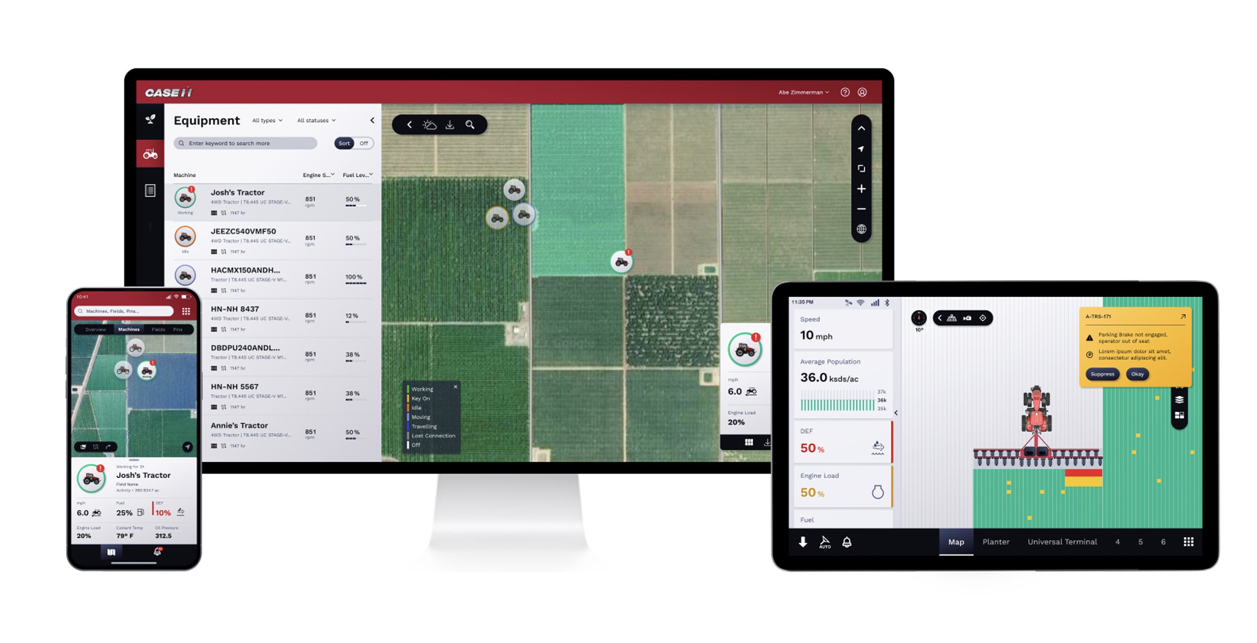
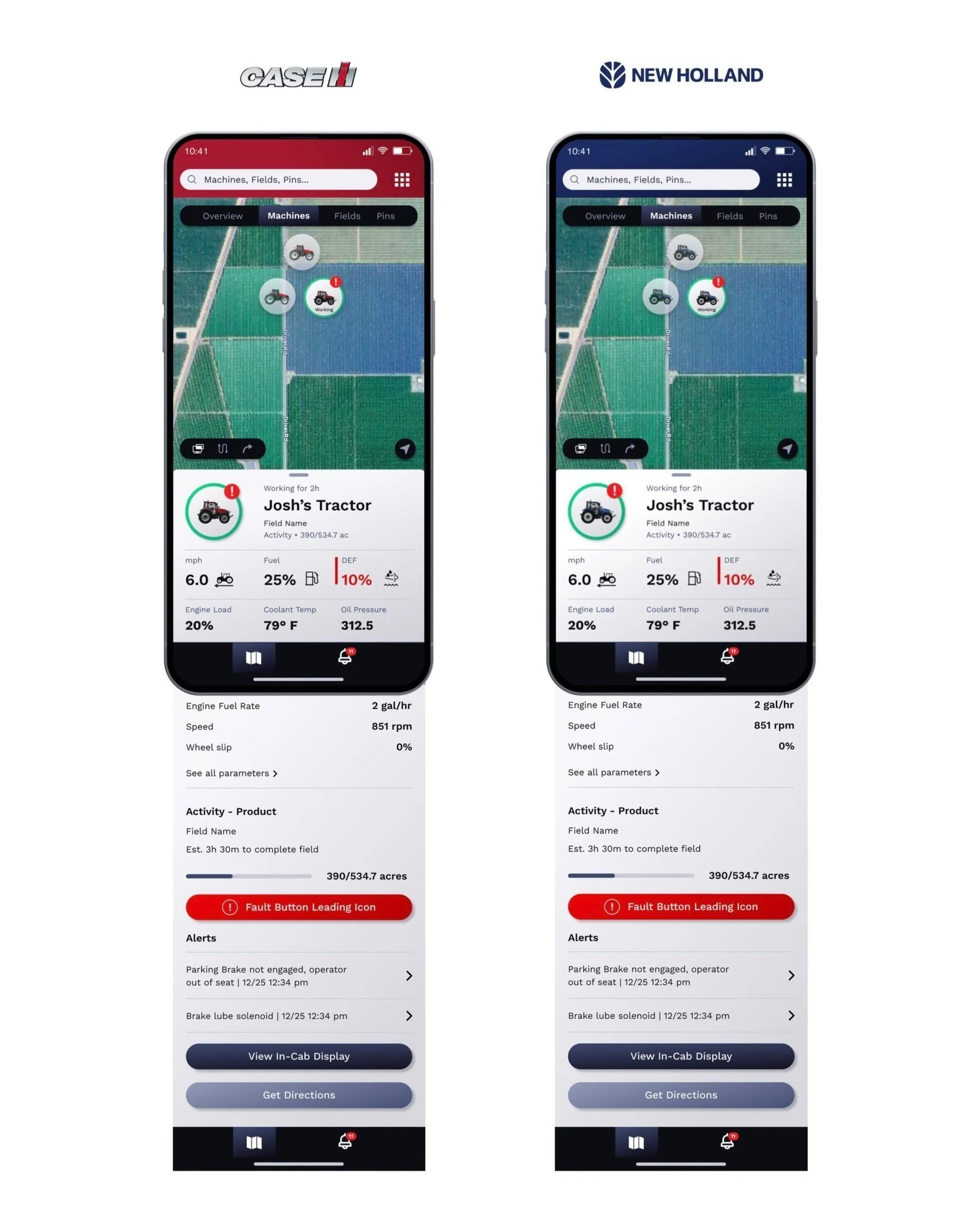
We turned insights and strategy into tangible solutions with our design language system. Modern, simple, and spacious design reduces cognitive load and makes complex data easier to understand. We set CNHi apart from competitors' cluttered and outdated UI. Bold color blocking adds a sporty touch, celebrating shared elements across the brands.
Master complexity. Unlock opportunity.
In the face of complexity, cutting-edge Precision Technology, alongside a farmer’s own vast experience and skill, is a strategic countermeasure to chance – redefining the rules of the game.
Simple & Organized
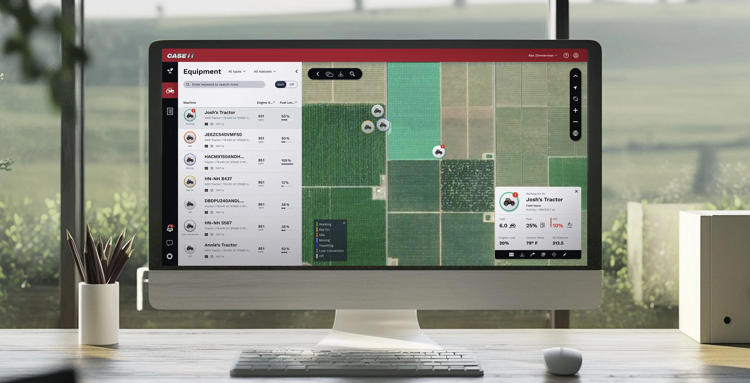
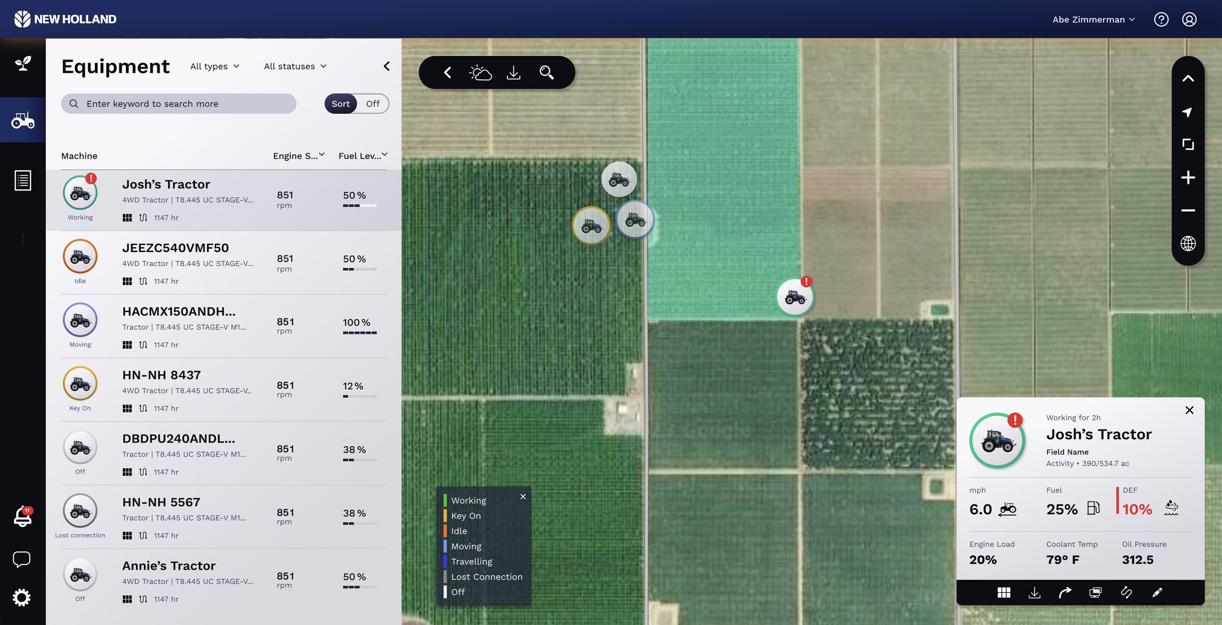
We organized scattered drop-down menus into clear groupings, ensuring optionality while improving usability. The layout works seamlessly across brands, with the top bar serving as a branding element.
-
Clean, airy, and flat design with touches of depth and light through background gradients.
-
Combines bold graphic shapes and a mix of soft and sharp edges, exemplified by a reimagined map.
-
Cool tone color palette supports both Case IH Red and New Holland Blue.
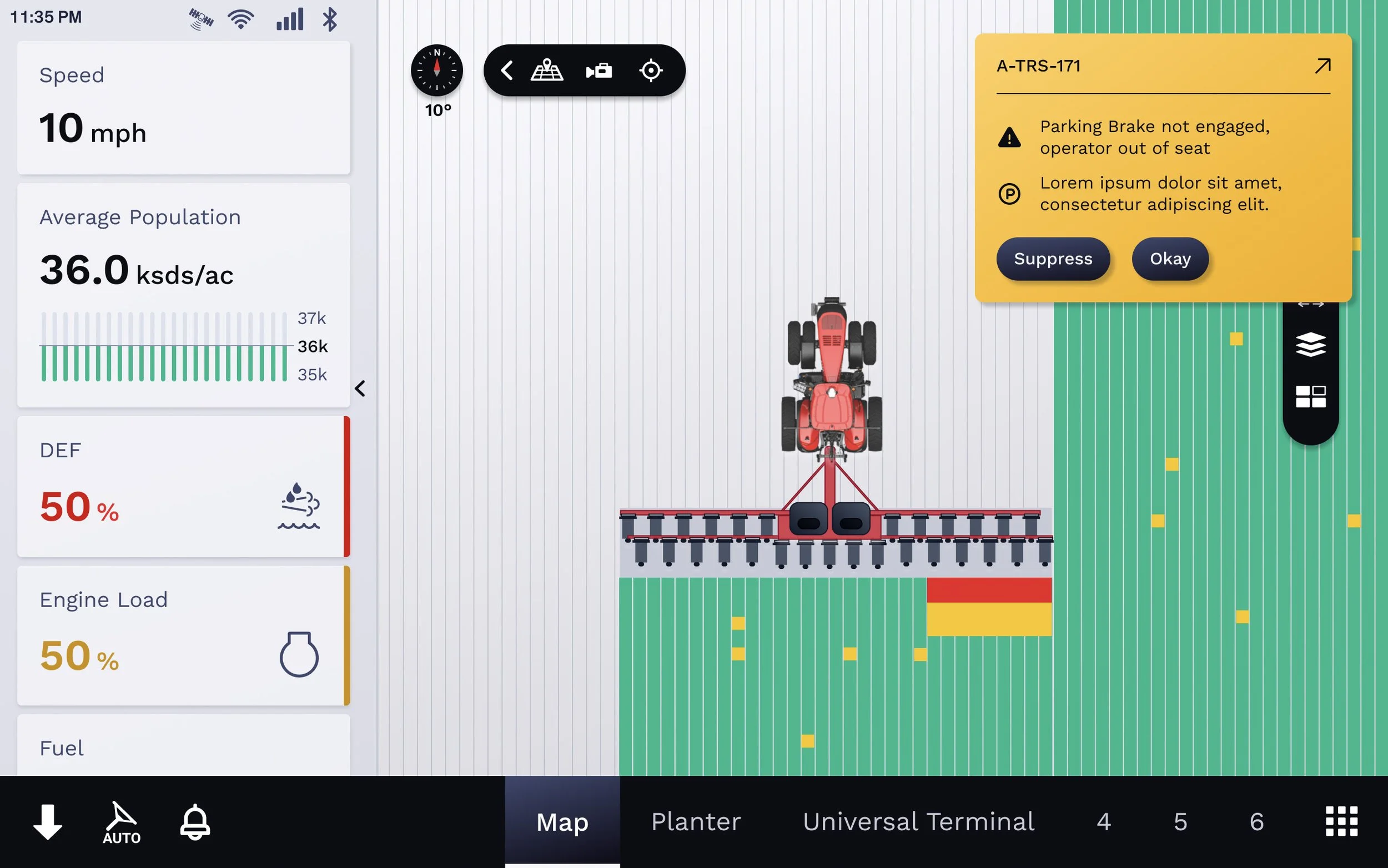
Easy to Read In-Cab
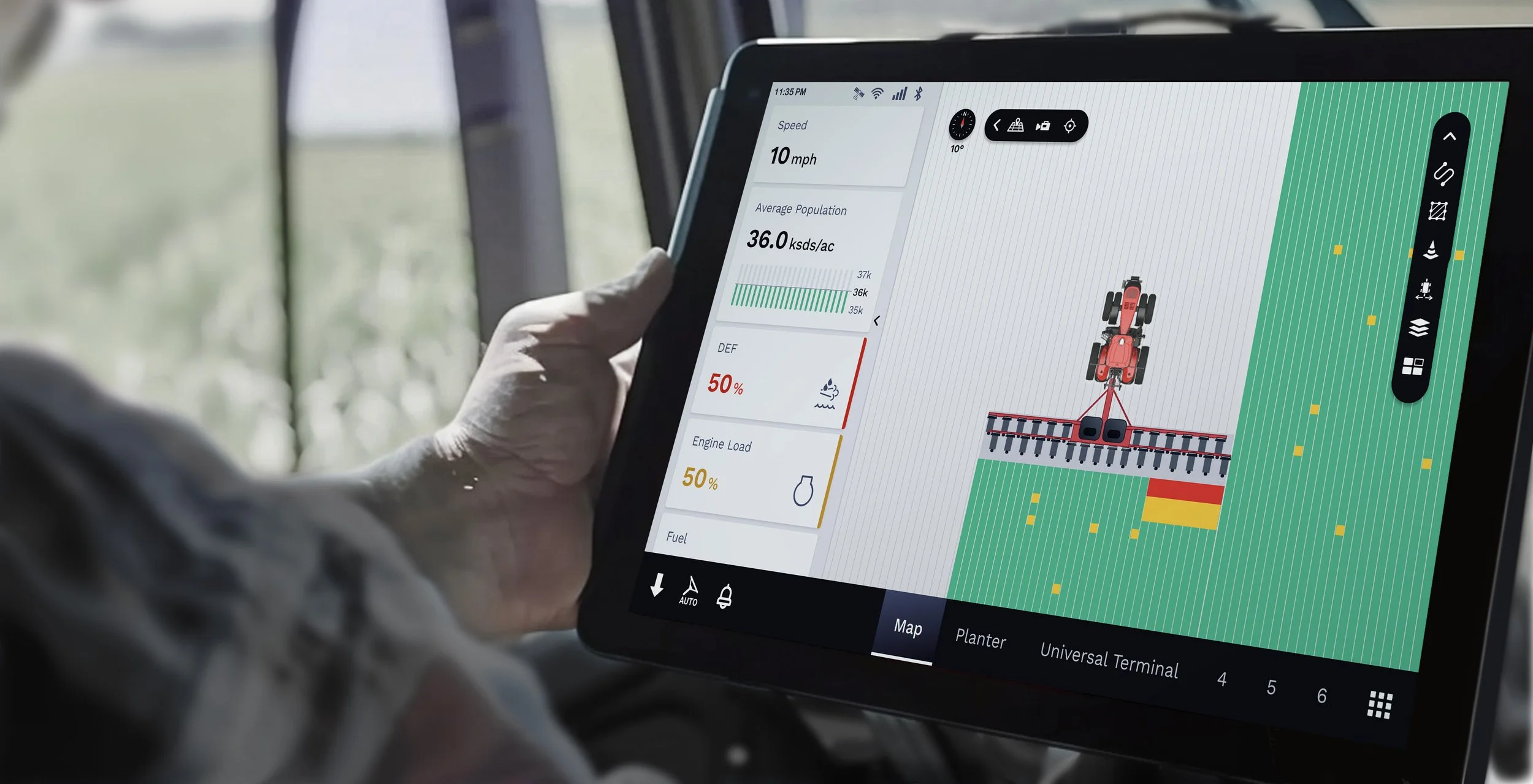
The simplified layout allows riders to easily glance at data while monitoring and driving. The redesigned map has become an iconic graphic pattern, and the card stack panel presents scannable information with simple visual cues for alerts.

